Understanding the challenge
EXXAT's mission focuses on helping allied healthcare students and faculty at universities connect with hospitals for rotations - basically an education management system similar to Blackboard.
Their suite includes the Student Training Education & Placement System (STEPS) which helps university faculty compile all the paperwork and documents to get students and hospitals connected with as little difficulty as possible.
Project Focus
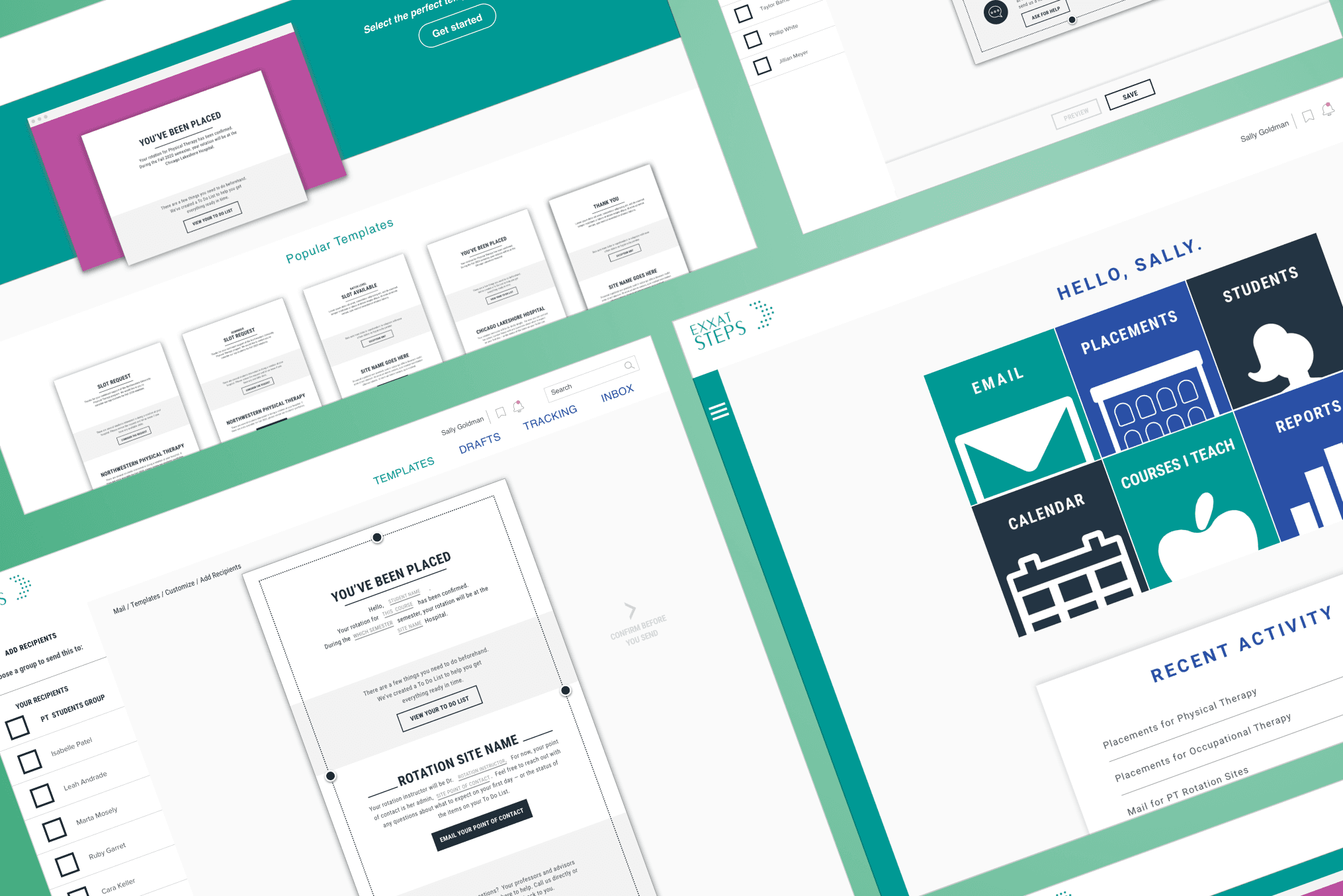
In the middle of a revamp of their entire EXXAT suite product, EXXAT tasked my team to evaluate their UX and UI for their STEPS dashboard and email functionality.
User Research Methods
To make sure we were hearing from the right people, we interviewed existing Exxat users and conducted usability testing with NYC healthcare professionals. Those conversations included faculty and administrative staff from universities across the US, working in Physical Therapy, Occupational Therapy, and other allied health programs. Together they surfaced insights into real problems and gave us the evidence to win buy-in from the client and stakeholders.
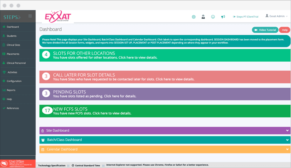
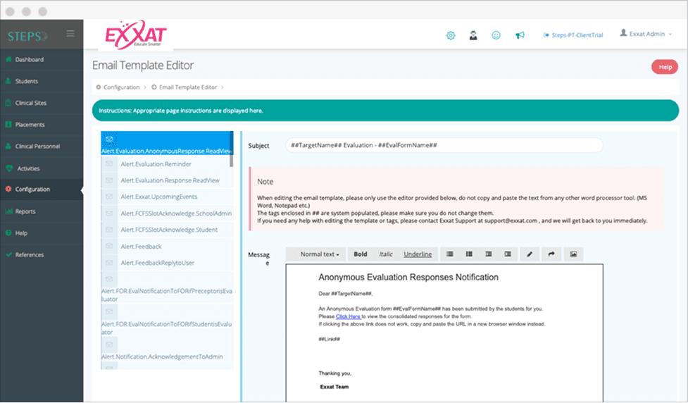
Additional research methods such as customer journeys, heuristic evaluations, and competitive analysis pointed to the same problems: a desktop experience built on disjointed colors with no clear labeling, and a confusing path to the Email Template Editor. Once users got there, they were frustrated they couldn't edit or customize their templates at all.
The amount of STEPS templates available to users: 86+
The number of templates actually used on average: 6
Each iterative version was reviewed with the Director of Product Innovation until we aligned on a design direction and next steps to validate success metrics.

We simplified the path to templates, added folder organization, and strengthened the visual elements and copy — giving users back the control to send hundreds of emails to students and faculty, faster. Testing the redesign with our original NYC healthcare professionals showed a 68% improvement in completed tasks.

