
Understanding the challenge
Three Hyundai Capital finance sites (Genesis, Kia, Hyundai) were 5+ years stale and visually disconnected from their OEM parent brands. Payments took more than 5 clicks to complete, causing user frustration. Help content was buried in the footer as an endless FAQ scroll. JD Power scores for payment and website user experience sat below industry standards.
Designing a seamless experience
We ran a competitive audit framed as "good / better / best" feature tiers, pitched two design directions, and was chosen as lead designer for the client, based on my selected proposal. The focus was on creating a seamless experience between the finance site and its parent site, Genesis.com.

Through intuitive navigation, a clean UI, and a mobile-first approach, we enhanced usability and boosted conversions. The redesign led to a measurable increase in sales and customer retention, with users reporting a smoother and more enjoyable shopping experience.
Project Timeline
12 months (2021-2022)
Shipped live: October 2023

Design popup interaction - easy scrolling between multiple offers
Make a payment quick click - embedded into dashboard experience without scrolling through multiple pages
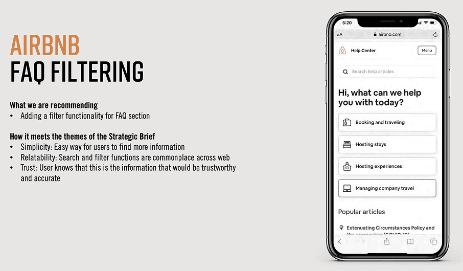
Large FAQ database converted to tile format

